Telkom’s Bold New Look: Why South Africa’s Telecom Giant Changed Its Logo in 2025
Summary
In 2025, Telkom, one of South Africa’s leading telecommunications providers, unveiled a completely redesigned logo and brand identity. The change was more than just visual - it marked a new era for the company. From the updated colour scheme to the deeper strategic thinking behind the design, here is everything you need to know about Telkom’s rebrand.

The Meaning Behind the New “T”
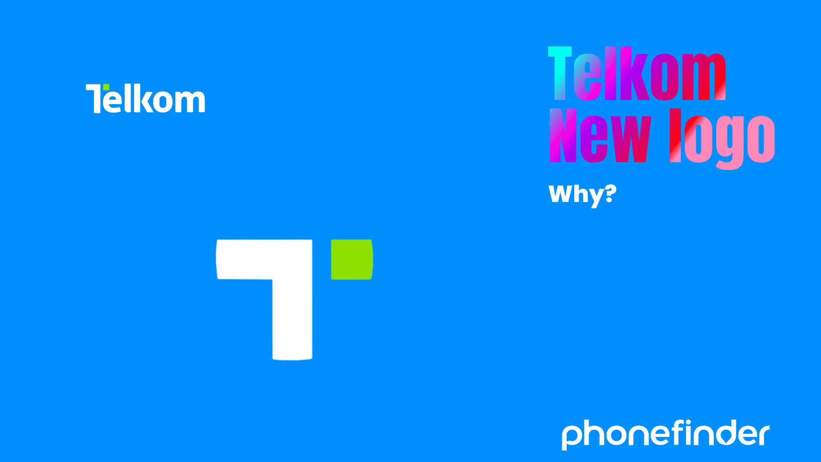
At the heart of Telkom’s new identity is the reimagined “T”- now known as the “Dynamic T.” While the core letter remains familiar, it has been modernised with a fresh visual accent: a diagonal green split that runs through the icon.
This addition is symbolic. The diagonal element represents progress, upward momentum, and renewed energy. It is a visual metaphor for connectivity and dependability - core pillars of Telkom’s services. By evolving the “T” rather than replacing it, Telkom acknowledges its legacy while pointing towards its future.
The New Colour Palette
Telkom’s original blue has been enhanced by a bright green accent; a choice that Telkom did not make at random. Blue represents trust, reliability, and professionalism. Green adds vibrancy, signalling growth, change, and the brand’s commitment to modernisation.
Together, these colours aim to strike a balance between stability and innovation—assuring long-time customers of consistency, while appealing to a younger, tech-savvy audience looking for progressive digital solutions.
A Strategic Repositioning
This is more than a design refresh. The rebrand comes at a time when Telkom is redefining its position in South Africa’s telecoms space. Following a strong financial performance - including a 62% rise in annual earnings and the reinstatement of dividend payments - Telkom is using this moment to present itself as a more agile, customer-focused business.
With renewed emphasis on mobile networks, fibre broadband, cloud services, and digital transformation, the updated brand supports a broader internal shift towards future-facing technology and customer empowerment.
A New Tagline, A New Message
Coinciding with the logo launch, Telkom retired its long-standing slogan, “Tomorrow Starts Today.” In its place comes “Possible Begins Here.”
This message highlights a renewed focus on the customer journey. Rather than positioning Telkom as a distant technology leader, the new tagline places the user at the heart of the digital experience. It suggests that new possibilities—whether in business, education, or personal growth - can begin through Telkom’s products and services.
Rollout and Implementation
Telkom’s new brand has already begun rolling out across its retail stores, website, advertising campaigns, and mobile platforms. Customers will start to notice refreshed shopfronts, packaging, and marketing material.
As part of its national rollout strategy, Telkom is also engaging the public through interactive pop-up stores, brand activations, and partnerships with local influencers. This approach is designed to create a sense of participation and dialogue rather than simply presenting a new image.
What Did It Cost?
While Telkom has not released specific figures, industry experts estimate that such a comprehensive rebrand - covering design, advertising, store updates, internal communication, and digital infrastructure - would run into the tens of millions of rand.
By comparison, previous local rebrands such as SABC1’s “Ya Mampela” campaign cost around R50 million. Given Telkom’s stronger financial footing and the breadth of its changes, the investment appears significant but aligned with its strategic growth.
Final Thoughts
Telkom’s updated identity is bold but calculated. It stays true to the company’s roots while positioning it for a more connected, customer-driven future. The new logo is more than a design tweak - it’s a symbol of intent.
By blending heritage with modernity, Telkom is sending a clear message: it’s still a trusted provider, but it is also ready for what comes next. For South African consumers, that means more digital options, better service, and a brand that feels relevant in 2025 and beyond.


